I can hardly believe it is June 21st already! The garden is blooming and there is so much activity in my backyard everyday. It is such a beautiful season. I love the heat and the bright colours of the flowers and the foliage.
This past year, I have been working hard on a special course release for the IAMPETH conference in Atlanta. With the conference being postponed, I worked on a special version of The Alphabet Garden which is now available for private students through Skype or FaceTime. The Alphabet Garden combines my love of the Victorian world and the botanical world along with traditional shapes of Medieval and Renaissance illuminated letters.
It will give the students a chance to learn about drawing their own historic versal letters and strategically adding embellishments. It has been a welcome distraction to design this course of study and I began to expand the garden to included more stylized letterforms as well as inhabited initials that could incorporate a more botanical subject or a butterfly. Students will be able to choose how many lessons they want to sign up for if they want to expand the basics into a more complex design such as a bordered initial or an inhabited initial.
Like all illumination courses, there are so many possibilities that it is difficult to stop! If you are interested in studying privately with me please email me at heather@heathervictoriaheld.com to discuss the possibilities.
With so many of us being at home right now, this is the best way for me to connect with you and help you on your calligraphic, painting and illumination journey.
Whatever you are doing on this beautiful June Day, I hope you take time to enjoy the calming presence of nature and do something that brings you joy. Be patient with yourselves and with others in these curious and uncertain days. Sending hugs to you all. Happy to chat if you want to send me an email. Sending special Father's Day greetings to all of the precious Dads out there as well. Love you all!
Sunday, June 21, 2020
Friday, May 29, 2020
Thoughts In Bloom
I just realized that we are near the end of May and I have not posted to the blog this month. I wanted to touch base here with some words of encouragement and some updates. I hope you are flourishing wherever you are in this world. One of the joys I have as an instructor when I present The Artful Flourish or any of my flourishing workshops is to explain the root meanings of the word Flourish. The word I want to focus on right now is "bloom". To translate that root word into the framework of offhand flourishing worked for me as I worked as a florist for many years. Essentially my offhand flourishes are in many ways like little floral arrangements on paper. Let me share a simple floral garland. This design can work as an informal border that gracefully arches over your calligraphic script.
I started this design by drawing my baseline for the word as well as a light guideline for the shape of the arch over the word. If it helps you to have a centre line through the word and the arch then by all means, draw one in. I tend to keep my garland designs more organic, so I don't try to centre the arch precisely over the work. I think this also is rooted in my training as as florist. Nothing was measured, everything developed in the arrangement through training your eyes to visually balance a design.
Once your script is completed, you can embellish it to add some visual weight to the bottom portion of your design.
Next, start with a cluster of florals near the centre of the top garland. I used bleedproof white, a Hunt 21 pen point and my straight holder on a periwinkle colour cardstock.
The cartouche designs that create the cascading shape of the garland are expanded from the centre outward. I usually work on the left hand side of the design and then turn the paper to work on the right hand side of the design. When working on a flourish, you begin with your largest elements first. Accent strokes are added to flesh out the design and to balance the shape. Always think of your accent strokes as jewelry you are adding to enhance the design. They add a lot of visual weight to the design especially when colour is added. I used Fabercastell Polychromos pencils to embellish the design.
The final touches to give the piece a touch of sparkle were with the Hot Foil pen, a little bit of Diamond Stickles in the centres of the florals and my favourite Sakura gelly roll pen in Clear Stardust.
These small designs take a few minutes to complete but they are such a good way to hone your pointed pen skills. You really learn to see the negative spaces in a flourish which translates to how you see the counterspaces in your script alphabet. Flourishing is the easiest of all of the pointed pen studies that you can attempt. It sometimes just takes someone to point you in the right direction with it. The practice is peaceful and meditative as you watch your paper bloom. It is a wonderful mental break for you and it brings so much joy in the journey. I encourage you to keep paper handy on your desk, cut to a reasonable size for a small flourish like 5"x7" and flourish for a few minutes. You will be amazed at what you produce. This practice really does free your mind from worry and stress as it is fully engaged in the process on the paper. Flourish and bloom dear friends! I will update the blog again shortly! As my travel is on hold for my teaching engagements, I am taking more students privately online. I will be launching a new online course very soon and will tell you about it shortly! In the meantime, I am here at heather@heathervictoriaheld.com if you need to chat. You can follow me or direct message me on instagram at heathervictora1. Sending hugs all around.Tuesday, April 28, 2020
Easy Layout Tutorial
I have been enjoying the Live Chats on Instagram that have been hosted by the European Pointed Pen Collective. You can view some of the past videos here. Sunday's chat was with Dr. Joe Vitolo. Back in 2003, when I was trying to figure out all of the nuances of the pointed pen ( without the help of Instagram or Youtube all those years ago) Joe was instrumental in advising me how to proceed and introducing me to IAMPETH. Through IAMPETH, I met my mentors and my dearest friends and really changed the course of my career path as I eventually became a professional calligrapher. Joe's words of "pay it forward" have really stuck with me. This little tutorial is my way of sharing with you during this difficult time. I want you to continue to find joy in the journey as you put pen to paper and expand your skills. Maria Helena gives a very inspiring LiveChat which is also available on the EPPC's website. My method for layout is very simple. I mainly use a centred layout or a left justified. My method for layout it "old school" having learned it from Michael Sull during one of my early times at The Spencerian Saga. I choose to continue to use this old school method as it really helps me to work out the nuances of the words as well as embed the wording in my head. I am someone who needs to experience the rhythm of the writing and see how the words unfold on the paper in front of me.
Once my text is determined, I choose the script as well as the guidelines I want to use. This particular commission was to be done in Spencerian Script. The guidelines I used were Michael Sull's Handwriting Sheet A. I write the words using the guide sheets on layout paper to get a measurement of how long each line will be. I do this stage in ink rather than pencil.I want the layout to be reflective of the materials that will be used in the final piece. This first time writing also helps me to become fluid and familiar with the words as I write them.
I also get a sense of how the lines will interact with each other. Once the words are written, I measure each line as well as the height of the written piece. This helps me to determine the size of the paper I will need for my layout. The paper choice for this piece was a 9x12 sheet of Stonehenge Aqua Cold Press Paper. I wanted a little bit of texture on this design. I used McCaffery Black ink and watercolour for the Victorian Line and Wash Technique of the florals.
Next, I will pencil a centre line on my guidesheet as well on my art paper.
The centre pencil line serves as a registration mark for me. On this particular piece, I also drew a pencil line of an oval as a boundary for my border flourish. I use Scotch Repositionable tape and to adhere the guidesheet to the art paper. The Scotch tape will not leave any residue on the art paper and will not damage the paper when it is removed.
Using a light table and my measured lines of text I will pencil the baseline for each line of the composition. I use a stainless steel ruler that has very clear markings so my measurements can be precise. The simple process is to make sure you divide each line in text in half so it will be correctly centred on your art paper.
Once the pencilled baseline is in place, I will write the text in Spencerian Script while the guidesheet is being illuminated through the light table. This will allow you to maintain proper slant as well as finding the correct ascender and descender height. But it will also allow for a certain freedom in writing. You don't want your guidesheets to become iron bars for your text. They should gently guide without being overly restrictive.
The lettering is always done first. Once I am happy with the lettering on the art paper, I will proceed with the flourished border. My flourished borders are not preplanned or pencilled beyond the oval line that is drawn. I prefer the true offhand method of flourish which means my border is visually balanced rather than formally balanced. A formal balance would mean that each side is identical. I prefer the more organic and lively look of a true offhand flourished border.
If you have tried the wreath and the heart in my previous blog tutorial, I would encourage to you to try a larger layout and design. The oval border is a great project with lots of opportunity for flourishing.
I did not have an oval template that was large enough for this piece but there are many that you can find online and print out to serve as your guide. Let me know how you do with this tutorial. I would love to see your work! Pick up the pen and flourish my dear friends. You can email me at heather@heathervictoriaheld.com if you want to chat or if you want more info about private tutorials online. Sending hugs all around.
Friday, April 17, 2020
Italian Hand
Yesterday I had the honour of doing an Instagram Live Chat hosted by the European Pointed Pen Collective. You can find them on Instagram through @learnpointedpen. We wanted to discuss Italian Hand as I hope to visit Europe again in September to teach this hand in person.Throughout the past few weeks Kate and Cecilia have been hosting some inspiring live chats. I have loved them all. When I started studying Italian Hand about 10 years ago I went into an avenue of research that was entirely new to me. I looked through my history books, researched online and consulted my friend and historian Don Marsh who has an incredible knowledge of the hand. However, this hand is shrouded in lots of mystery that still intrigues me and causes me to investigate further. I could not dive into all the details during the live chat but hopefully I stirred up some interest. You can find a treasure trove of copybooks online now at the pennavolans website. Some of my favourite resources can be found there. I want this blog post to be a bit of a starting point for you if you want to dive a little deeper. I do offer private tutorials in this hand ideally taught over a period of six weeks. You can email me at heather@heathervictoriaheld.com for details. The first book I started with was George Bickham's Penmanship Made Easy
which is a Dover reprint and readily available. You won't find any instructions on how to do the hand but you will find it contrasted with English Roundhand so you can clearly see the differences in weights of shade, spacing and the compression of the script. If you only had this one resource, you could easily start to navigate the script. Page 32 pictured here was one of my guiding pages as I started to put the script together.
When I study this page, I look for the clues it gives me. I look at the placement of shades, the delicacy of the terminal lobes on the capital letters, the compression of the letterforms and the simplicity of the script. The exercise in observation helps acquaint my mind with the letters. It is really only through the process of the mind being able to see the letters that your hand can eventually catch up and start to do what is clearly envisioned in your mind. I can't stress enough the power of observation. In the beginning, I enlarged the page from the book so I could really see the details clearly.Practice in pencil and draw the weighted shades if that helps you to understand the hand. Observe the simplicity of these capitals. The real beauty of Italian Hand lies in the gentleness and simplicity of the lower case.
Page 29 also provides wonderful study material.
The exemplar clearly shows the spacing differences between (Round Text) and (Italian Text.) See how delicately the shades are applied on the Italian Hand. I often do this through a retouch movement that becomes part of the rhythm of my writing. Throughout the years, Italian Hand has become fluid in my thinking process. I can now write this hand more rapidly than my Spencerian Script and English Roundhand.
Right now, we are navigating some uncertain times. I recognize that a private tutor in calligraphy may not be in the budget. I wanted this blog post to put some details about the beauty of Italian Hand in front of you so you could start to do some practice on your own. I will gladly add more details about the hand if you find this to be of help to you. I am also working on updated exemplar in my own hand that I will post soon. If you have any questions, by all means email me. I hope you spend some time looking and practicing. I realize I haven't posted every single detail about how to practice this hand. but I hope I generated some interest and intrigue. When I practice, I use a straight holder. This hand does not require an oblique holder. A good nib to start out with is Hunt 101. Walnut ink is a wonderful ink for practice work. My favourite guide sheets for practicing this hand can be found on the IAMPETH website. I use the 55 degree guide sheets that can be found in this pdf file.My new favourite practice paper is Daler Rowney A4 Layout Paper. As always, feel free to email me at heather@heathervictoriaheld.com. Let me know how you are doing with Italian Hand. It is a delight to practice and it will dramatically lighten your touch with the pen. Enjoy!
Sunday, April 12, 2020
Sharing Hope
Wednesday, April 1, 2020
Heart and Home
Happy April dear friends. I hope you are keeping well. This is indeed a strange and stressful time, unlike anything we have experienced before. These days I find myself being so grateful for things that I used to take for granted. My routine has changed and I am getting used to a "new normal" as I am sure you are too. I find myself visiting my home library much more often and appreciating what is on the shelf. Over the years, I seem to have collected not only art supplies, papers, inks and paints but an abundance of books. Each one served a particular purpose when I purchased it but it is time to revisit the pages and wisdom on the shelf. There is so much to glean from each page. I encourage you to visit your home library and revisit an old friend on the shelf. Right now, we have the time and the effect can be such a welcome pause during this unique time.
A couple of weeks ago, I shared a Spring wreath tutorial with you and had so many thankful emails. I am so glad you enjoyed the tutorial. I have added a few more images here of the same idea, but expanded to a heart design. You begin the same way with a simple heart outline. Bear in mind that your pencil outline will need to be erased so keep the line light and delicate. If you use a B pencil it really helps to deliver a very faint line on the paper. When I want to incorporate some calligraphy in the flourish, the lettering is always done first. When writing a single word I often use a pencil line for the baseline and the x-height.
When I begin a heart flourish, I usually turn the heart shape so the point is facing away from body. I then begin to flourish along the right hand side of the heart with the small cartouche strokes and floral clusters. Before doing the left hand side of the heart, I make sure that the right side is dry. You don't want to accidentally brush your hand through wet ink.
Proceed the same way as outlined in the wreath flourish tutorial. This flourish was painted with watercolour and embellished with finetec gold and the Sakura Clear Stardust Gelly Roll Pen. I used McCaffery brown ink on Strathmore Bristol Vellum Paper.
The same method applies to any shape and size. The layout method is a bit different for something as large as the oval design pictured, but the flourishing technique is the same.
The final image is a group of flourishes I completed for The European Pointed Pen Collective Envelope exchange. The floral flourishes are painted freely in watercolour rather than the Victorian Line and Wash method but the flourishing method is similar.
Whatever you decide to try, I am here to answer any questions. You can email me at heather@heathervictoriaheld.com. Remember that you do not need to use the same supplies that I use. I encourage you to start with what you have and try your hand at this peaceful and meditative art form. With my travel schedule being altered at the moment, I have more time for online private sessions. If you are interested in more details about The Artful Flourish course, The Enchanted Meadow, The Enchanted Letter, Italian Hand or any of my other workshops please contact me and I will be happy to send you info. Keep calm and Flourish On dear friends. We are in this together.Thursday, March 19, 2020
Spring Wreath Flourish Tutorial
I am always amazed at the meditative and peaceful process of offhand flourishing. Whenever I flourish, I am aware that my breathing gets a little deeper and all of my focus is on the paper in front of me. One of the definitions of flourish is "to bloom". Let me share this process of how to bring a spring wreath to bloom on your desk today.
The wreath design is just a suggestion. You can use any shape you want. A heart, a square, an oval. Absolutely anything. I used a circle template to transfer an outline in pencil. My paper was Strathmore vellum finish Bristol cut to 5" x 7". Supplies used for this design: Straight pen holder with your favourite pen point, McCaffery Brown ink, Watercolour pencils, Watercolour, Pastels, Finetec Gold, Hot foil pen, Sakura Gelly Roll Clear Stardust pen and a little bit of stickles glitter glue for floral centres.
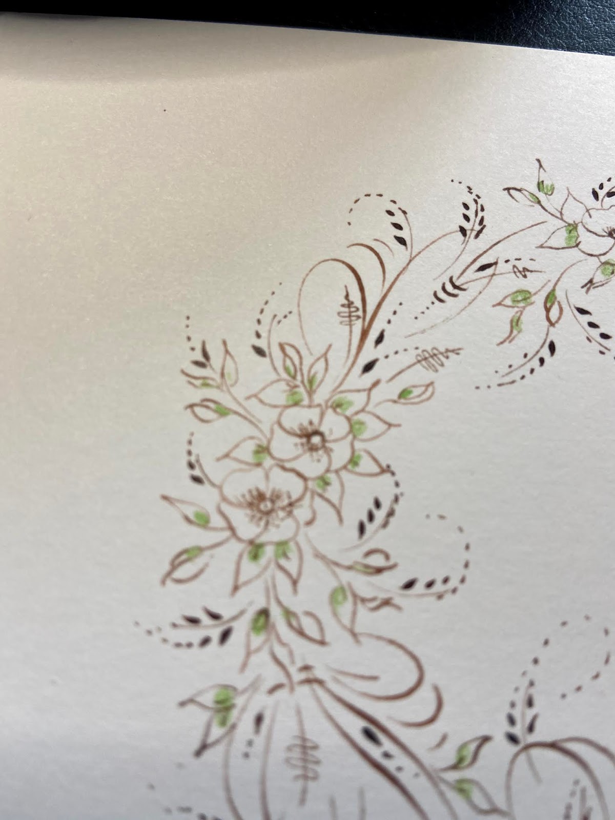
Once the outline is on the paper, I placed a small cluster of flowers randomly on the outline. The secret to clustering little floral bouquets is to allow the flowers to interfere with each other a little bit. I always tell my students to draw them a little too close for comfort. The florals are not predawn anywhere in pencil. I am using pure offhand flourishing techniques and building up the design one ink stroke at a time.
You can see in the photo above how I begin to proceed around the outer shape of the circle. I am adding small cartouches in between the little clusters of flowers. The flowers themselves are very simple to do. You can go to my YouTube channel to see more of my flourishing which includes some florals. My festive flourish 2017 on the YouTube channel starts with a floral.
Once the florals and flourished cartouche strokes are all the way around the design in ink you are ready for the colour stage of your design. I am using a Victorian Line and Wash technique for this wreath. The Line and Wash technique requires a waterproof ink which is why I used McCaffery Brown for this wreath. McCaffery Brown is always my favourite choice for this technique because the colour is so soft, Other inks that work for this particular technique are McCaffery Black, Old World Iron Gall, Ziller Buffalo Brown and Fox And Quill's Victoria Ink. If you are not going to use any watercolour on this design, you can use any ink at all.
The next stage of the design is to add your colour. I am starting with a very light application of water-colour pencil. I am using Staedtler Aquarelle for this wreath but any watercolour pencil will do.
I started by colouring all of my leaves around the wreath in a medium spring green colour. I apply just a touch of the watercolour pencil near the base of each leaf. Once the green has been applied, I proceeded to add a touch of pink to the petals of the flowers just near the base. You want to avoid overly saturating the petals with the pigment.
You can see just how lightly the pigment is applied in the photo above. Once all of the petals and leaves have been given a light application of watercolour pigment, I use a very small watercolour brush and start to disperse the pigment with clean water. Once this first layer of colour is completed, you end up with a very gentle application of soft colour on your design. The ink will not bleed when water is added because you have used a waterproof ink.
My next stage is to heighten the colour a little bit. Using my watercolours and a very small brush, I will add just a touch of darker pigment near the base of each leaf and petal. I do this to start building a sense of dimension to the wreath. My favourite green to use is Sap Green and my favourite pink is Quinachridone Rose.
You can see how I coaxed some dimension from the petals and the leaves as I proceeded around the wreath. The question I usually get at this point is "when do you know you are finished?" There is no easy answer to that question. It looks fine the way it is but I know I can add a bit more sparkle to this piece. Using pastels, I then added a burnished background in soft pink and green. My final touches where to add some shadow strokes with Finetec gold ink. The last touches were a few hot foil dots in emerald green, some joyful strokes with the Sakura Gelly Roll Clear Stardust pen and some Diamond Stickles glitter glue in the centre of each blossom. The wreath design is a bit more involved and time consuming than other flourishes. From start to finish I probably spent 45 minutes to an hour on this little flourish.
The point is to enjoy the process and be absorbed in each of the details that you add to the piece. I hope you enjoy the process. You can do this in so many different colours or experiment with your own favourite papers and inks. Just try it!! It is easier than you think. I am constantly reminding my students that offhand flourishing is the easiest of all pointed pen techniques to learn. It is far easier to learn than any script alphabet. I do teach this type of offhand flourishing online privately. You can email me at heather@heathervictoriaheld.com if you want details about The Artful Flourish course. Or, if you have any questions about this particular flourish, feel free to email me. I hope this flourish brings you joy and a touch of colour to your desk today. Sending hugs to you!
Sunday, March 15, 2020
The Gift of a Pause
I thought it would be good to add a second post this month. Many of my scheduled plans are on pause as my travel plans to teach 5 workshops this month have been postponed. Many of us are finding ourselves with some unscheduled changes to work with. I have a very graphic imagination so I am being very careful about how much media I tune into right now. I want to share some joyful and very simple moments that might brighten your day as well.
The first crocus blooms are in the garden. They never fail to bring me a sense of delight. I worked as a florist for 18 years and never failed to see the wonder and beauty in a flower. Even now as pansy seeds continue to grow on my desk, they all contain such potential wonder as I anticipate their blooms. Delight yourselves in the beauty that surrounds you! If you look for it, you will find it.
For years, I did Victorian Embroidery, Needle tatting and crochet. I had a vague understanding of knitting but was not very proficient at it. This past winter, I have been revisiting it a bit and really have enjoyed the meditative moments it brings. This is a scarf in progress for my Dad. If you look closely you will see my cat Ron's feet on the coffee table. He loves pouncing at the yarn. It amazes me how long he can look at something and just sit and purr. Again, another moment of delight.
Painting pens is always a joyful activity but sometimes becomes stressful as I run out of time to do it. I have been able to take my time a bit more as I paint the pens and try new ideas. I still love the tiny details!
Finally, I had the pleasure of testing out a new detail brush. I am moving more toward synthetic brushes over sable and had so much fun painting this little sparrow. The words of the song " His Eye is on the Sparrow" kept going through my head as I painted the miniature. I remember singing it as a child in Sunday school. Underneath the painting of the sparrow is a piece of hand crochet lace I found in our local antique shop. I still love rescuing old lace and was so thankful for whoever created this piece. Again, it brought me a moment of joy! I just wanted to share these few small things that brought me some joy and peace. I hope your day brings you some delight and beauty no matter where you are or what you are doing. Thank you dear friends for reading this blog, emailing me from time to time and being a huge part of the joy of my life! Hugs all around!
Sunday, March 1, 2020
The Magic of March
I am so looking forward to spring. I couldn't resist planting some pansies on my studio desk and I am enjoying watching this emergent stage. Appreciate the little things...even slow beginnings. That seems to be the underlying wisdom and magic of March. As soon as I turn the calendar to March, I expect greenery and flowers but it will not be rushed.
Spring cleaning is just starting in my house and studio. I have just completed the IAMPETH 2020 workshop notes for The Alphabet Garden. Now I am working on the expanded handouts for my private students and guild workshops. It has been so good to study and glean from various sources.
My style and technique continues to evolve as I work on this material but just below the surface of all the work that I do is a deep love of nature. It spills into all of my flourishes and painting. I just want to share the beauty and joy that it brings me.
I am constantly reminded that the driving force of this work is really passion. Sometimes, inspiration is hiding and not easily found. Sometimes, we fail as we work on our projects or practice pages. Sometimes, deadlines feel like pure stress. Sometimes, we meet sadness on this journey that makes working difficult. Sometimes, it seems like I discard more work than I keep. So why do I keep showing up at my studio desk? I think the bottom line for me is that after all of these years with pen and brush, I remain intrigued. There is the desire to continue to learn. That desire has never diminished.
My encouragement to you this month is revisit the things you are passionate about. If you love practicing Spencerian in pencil, then practice in pencil. If you love drawing flowers, then draw flowers. If you love looking at books, then pull out an old favourite and go over the material again. My dear friend Brian Walker would constantly remind me that this was all "grist for the mill". Refresh yourselves in the things you are passionate about. Go slowly..and enjoy.
Tuesday, February 4, 2020
This and That
Happy February dear friends. I hope you are all getting through the winter season and setting your sights toward spring. Here in Ontario, I can see my lawn and there are actually chipmunks outside getting some exercise. Surely usual for February but I am not complaining.
The opening photo of this blog post is a demo piece that I created for one of my private students. My online private tutorials are where I have been spending lots of time these days. I am working with a few students in a longer term mentoring program and I will talk a bit more about that in the future.
Today I wanted to share a few things on my desk that are making me really happy. Cornellissen's Walnut ink is my current favourite practice ink. It is not listed on their website yet as it is a fairly new product for them but this is beyond doubt the finest walnut ink for pointed pen work I have ever found. The hairlines and shades are pristine and it makes practicing much less harsh on our precious vintage nibs. Give it a try! You can send them an email and they will provide details.
The other two recommendations I want to share are the Faber Castell Dust Free eraser and the Taper Point Colour Shaper. The eraser is definitely not dust free. But as a white vinyl eraser, it does a better job than any others in my tool box. Even problematic papers for erasing are no problem at all with this eraser. I highly recommend trying it. The colour shaper is my new favourite tool for applying gilding size. Because there are no brush bristles to worry about, the gilding size is applied perfectly every time, I bought the smallest size I could find and can even apply small dots with the tip of the point. Another wonderful tool to add to your toolbox.
Have a wonderful month! Play with the pen, flourish a bit or a lot and enjoy the journey!
Subscribe to:
Posts (Atom)


