Just a quick post today as I will be taking a bit of a break for August. I hope to finally visit with my daughter and son-in-law. After Covid keeping us apart for 3 years, we are looking forward to seeing them. I still have some commitments with private students this month as well as preparing for an advanced flourishing class in September. I will post details for registration when they are available. The Gentle Penman have opened registration for The Festive Flourish on their site and our encore William Morris Flowers presentation is open for registration on the Ardington site. I am really looking forward to these upcoming classes. This Spring and Summer, I have really enjoyed the thoughts and ideas of my private students. The greatest blessing is that we can explore any subject together. I don't have to commit to a specific course of study and I can take a deeper and slower dive into subjects that they are interested in. Some of my private students have requested Peacock studies in various formats. It has been funny how this is merging with my Pre-Raphaelite and William Morris studies. As I read and research my vision starts to get transformed. The work for this design transformed even as I began to sketch the lombardic P. My initial vision for this design was to create an Azure Blue P with simple florals inside the letter.

The Peacock was to rest on the lower exit curve of the initial. Many of my previous peacock explorations have been done in pinks, purples or blues. The inclusion of gold on the wing of this study was not expected when I drew my design. The colour and shape of the stylized poppy flowers are different that want I had envisioned for this design. Sometimes I am taken by surprise at what emerges on the paper and how far it diverges from my initial vision. The photo will not make this clear, but the tail feathers were first painted in quinacridone gold and then layered with Pthalo Blue, Viridian, Carbazole Violet, Smalt Blue and then Shell Gold. I used a Winsor Newton Series 7 miniature Size One brush for the entire design. The colours were unexpected.
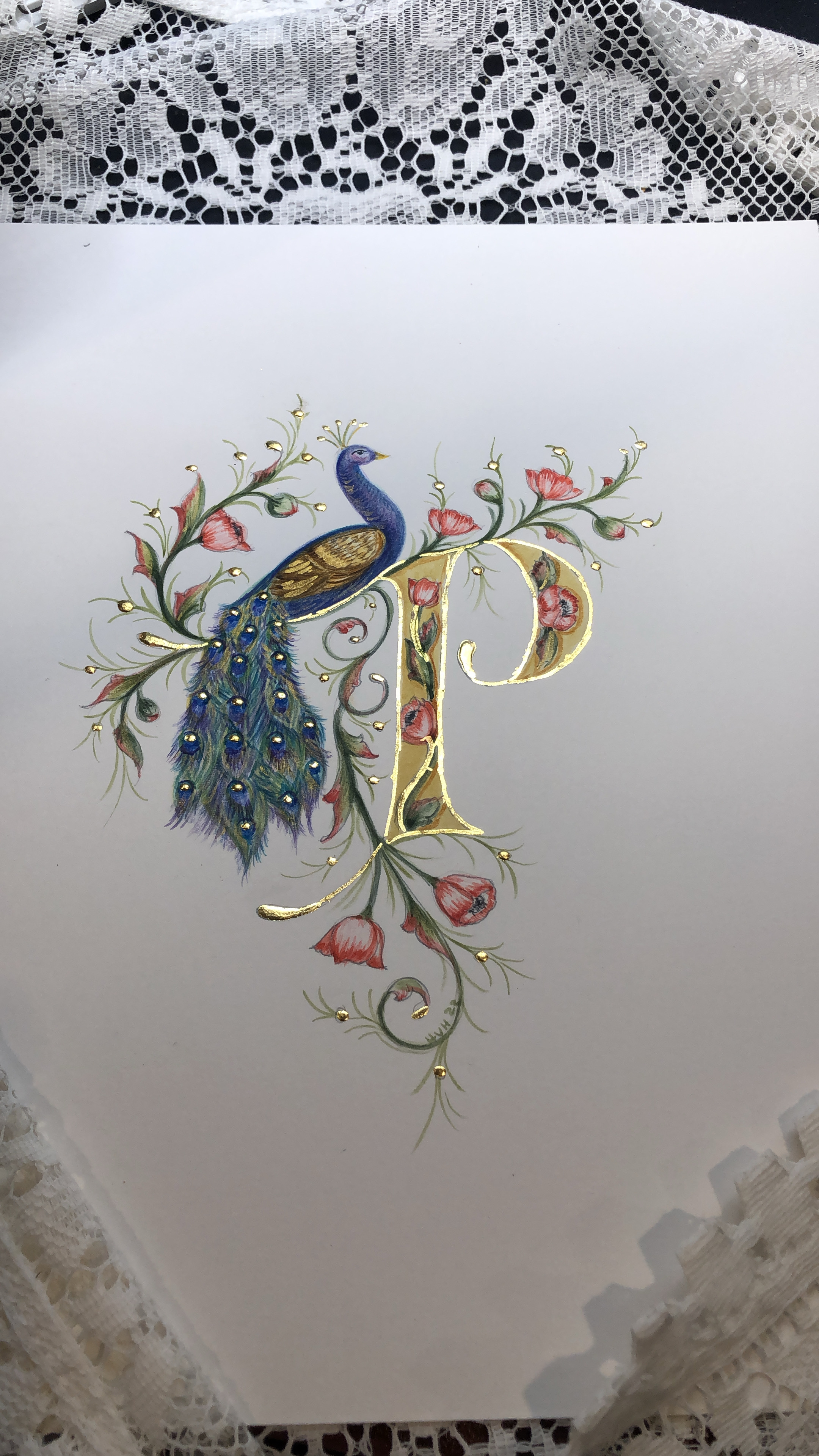
The process for this piece was so slow. I rarely put work aside once it has begun but this one was put aside several times so I could think about it before proceeding. I really had to be patient with this particular piece and let go of ideas that I had in the beginning. I finished the piece this evening and the final part of my process is to completely wash down my studio desk and put away all of the materials for this project. There is already a new idea in my mind and part of my process is to wash away the old project before I begin a new one. I have been doing this for years and it seems to work for me. You can see a bit of the mess of the desk in front of me and my mixing palette for the design. You can also see my initial rough sketch. I start simply and then refine the drawing on my watercolour paper before I start to paint the design. The little palette of gold is hand made Shell Gold. The making of the shell gold used in the design was also a long and patient process but such a delight to use.

As artists we need to keep a rather loose grip on our projects. Allow them to wander away somewhat from your initial vision and see what emerges on the page. I hope you are enjoying a beautiful August wherever you are in the world. Thank you for all of the encouraging emails and photos of your work. I have loved seeing your work and hearing about your process. Stay patient and curious as you work. I will be cheering you on.
No comments:
Post a Comment