Are you familiar with page 87 of the Zanerian Manual? I have an image of it here for you. The Zanerian Manual is considered the bible of American Engrossing. The images in the manual are wonderful but they are all in black and white. During my trip to IAMPETH in Scranton, I was able to see the actual specimen of page 87. This engrossing was done by Willis A Baird and is filled with intricate details. The vellum piece is badly faded and in need of reframing to try to readjust the engrossing back in its proper position but it was a delight to see in person.

Here is an image of the full colour piece that will be housed at the Weinberg Memorial Library in Scranton. 
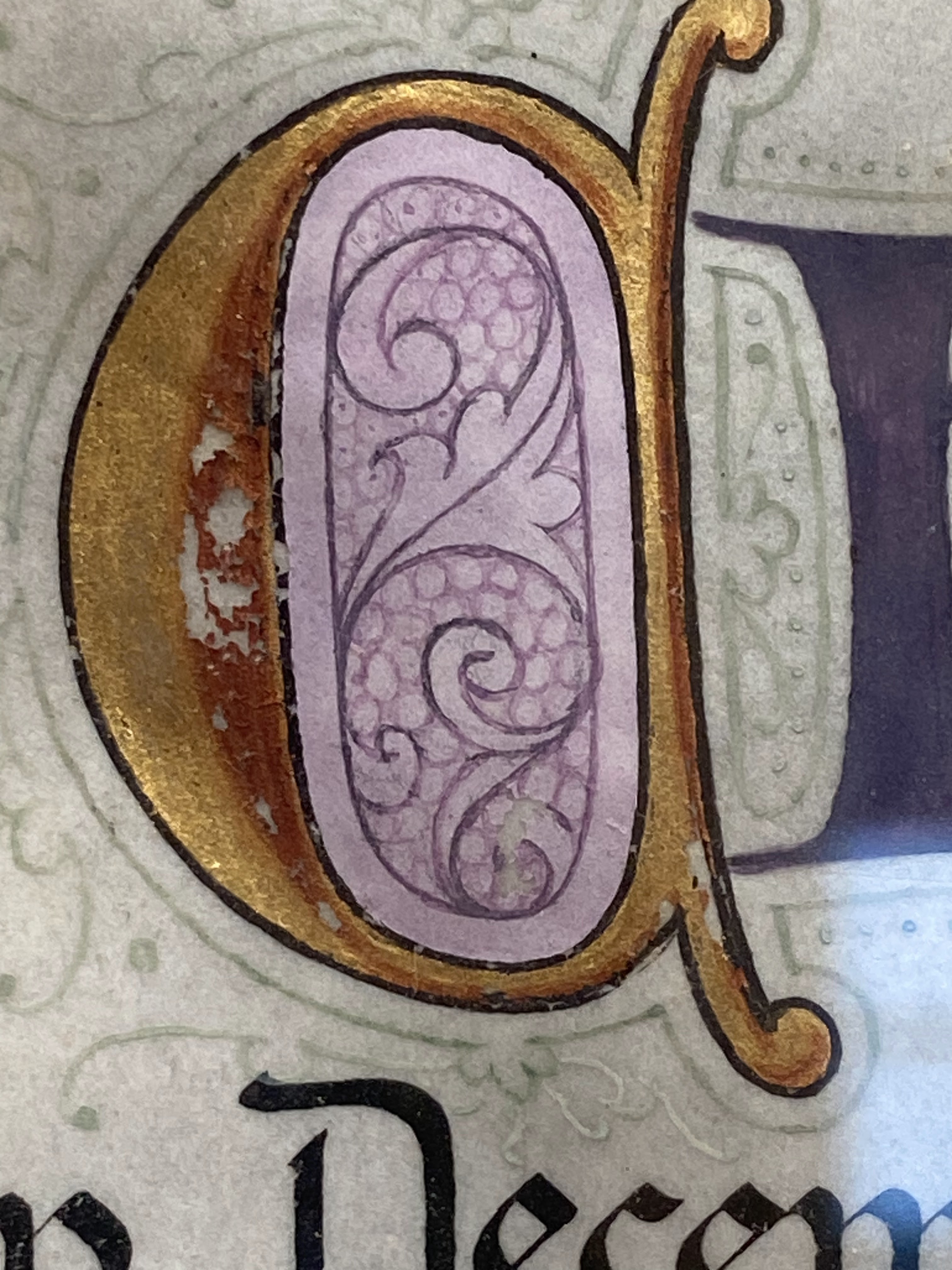
Here is a detail image of the A. The acanthus are positioned beautifully and the original colours would have been more robust and vibrant but this still has such charm and delight in its faded condition. Observe the delicate shading details that bring the acanthus to life.  Smaller letters in the composition are still treated with such detail and grace. There is brilliant precision in this letter.
  Once again, the shading in the T is subtle but effective. This is painted with such skill.
 Studying the composition in such detail and seeing the delicate colour transitions of the engrossed piece left me in awe and wonder. It always helps to see work in person and come in contact with the "living" work of an artist. I was overwhelmed with beauty of this piece. I think the original piece used cobalt colours and I also believe it was in direct sunlight to have faded so badly. The grey filigree work in the background is almost completely faded but what piece this would have been in its day.


As I prepare for my upcoming Victorian Pen class through The Gentle Penman, I have been reflecting on the delicate use of colour and the concept of abundance.
American Engrossing utilizes Abundance. The style will mix multiple lettering styles and even the style of Engrosser's Text seems a myriad of lettering styles compressed into one. Somehow, the quirks of abundance seem to work. The Victorian Pen class merges my love of gentle colour, abundant ink work and a touch of gilding to bring results to the page that over the years have become my signature style. I rely on McCaffery Brown ink which is still not technically waterproof, but has an amazing line quality to it and can hold up to watercolour washes.
Colours like Quinacridone Pink, Cerulean Blue, Sap Green and Quinacridone Lilac can create gentle palettes. Naples Yellow also makes a wonderful colour to include in this palette. I feel so inspired to share this class with you next week.
It is my last class of the Summer season before my fall classes begin and I hope to gather as much Victorian inspiration as possible as I teach this class. Many of my Victorian Pen designs have become greeting cards that I reprint and use over and over again.
I hope the workshop will be practical for you and will inspire you for years to come. Sending lots of August hugs your way. I hope your garden is still blooming for you. I can already feel a bit of change in the air as the nights become cooler and the garden goes through its August cycle. Find beauty and grace in your part of the world dear friends. Enjoy the work of your hands and be patient with yourselves as you develop new skills. Remember that we all work at our own unique pace and have different insights that we bring to a page. We are all on this journey together and your skills evolve over time. I am so grateful for all of you and love seeing the work you create. Thank you for keeping me so inspired and ready to teach the next class. Happy August dear friends.

American Engrossing utilizes Abundance. The style will mix multiple lettering styles and even the style of Engrosser's Text seems a myriad of lettering styles compressed into one. Somehow, the quirks of abundance seem to work. The Victorian Pen class merges my love of gentle colour, abundant ink work and a touch of gilding to bring results to the page that over the years have become my signature style. I rely on McCaffery Brown ink which is still not technically waterproof, but has an amazing line quality to it and can hold up to watercolour washes.

Colours like Quinacridone Pink, Cerulean Blue, Sap Green and Quinacridone Lilac can create gentle palettes. Naples Yellow also makes a wonderful colour to include in this palette. I feel so inspired to share this class with you next week.

It is my last class of the Summer season before my fall classes begin and I hope to gather as much Victorian inspiration as possible as I teach this class. Many of my Victorian Pen designs have become greeting cards that I reprint and use over and over again.

I hope the workshop will be practical for you and will inspire you for years to come. Sending lots of August hugs your way. I hope your garden is still blooming for you. I can already feel a bit of change in the air as the nights become cooler and the garden goes through its August cycle. Find beauty and grace in your part of the world dear friends. Enjoy the work of your hands and be patient with yourselves as you develop new skills. Remember that we all work at our own unique pace and have different insights that we bring to a page. We are all on this journey together and your skills evolve over time. I am so grateful for all of you and love seeing the work you create. Thank you for keeping me so inspired and ready to teach the next class. Happy August dear friends.