Happy July1st dear friends.We are well into the summer season already and I am savouring the warmth of the days knowing that this season is so short. I enjoy the morning sunlight filtering in through the windows as I begin my daily tasks. My workload is large even in the summers but I tackle the tasks slowly always taking time to recognize the beauty of these days.

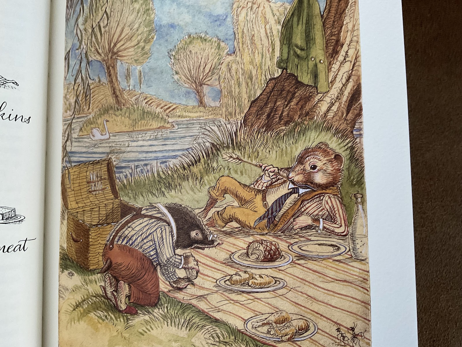
I have just completed some amazing classes for Ardington School. We had a wonderful time looking at Medieval Details in the Flora and Fauna class which has inspired more study for me! I am always happiest when I am immersed in research. And we completed the April, May, June edition of the Flourishing Club. If you want to join us for September, October and November, you can register online. As we worked together on Vintage Victorian Flourishes, I was reminded of what enticed me into the world of pointed pen in the first place. It was always the delicate flow of the script and the incredibly intricate world of offhand flourishing.


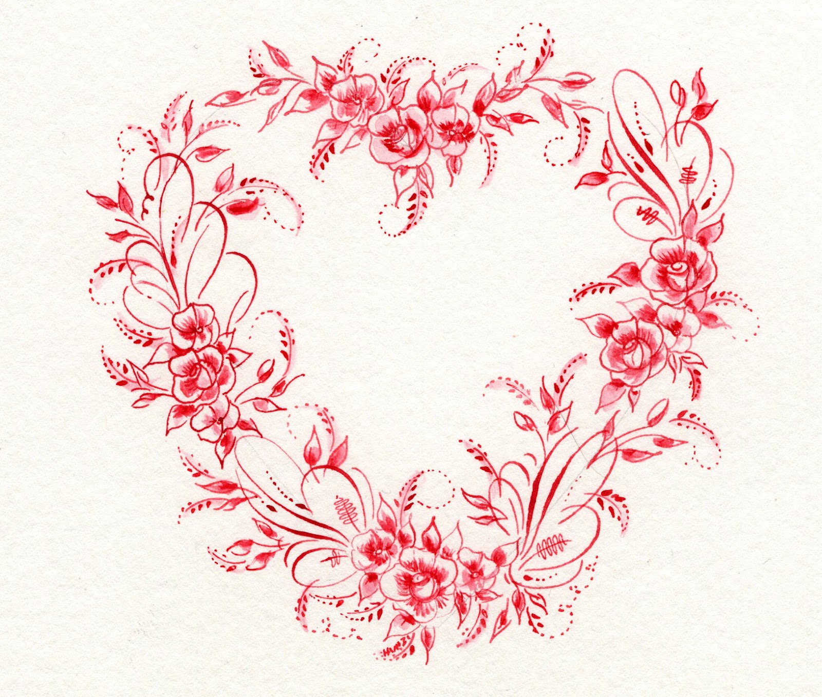
Each design is infused with wonder and possibilities. The designs can be intricate or simple, in colour or left solely as pen and ink. You can choose to add words to the image or let the image speak for itself. 

This summer, I have bee doing daily bird flourishes as well as floral flourishes as I prepare for Wildflower Wonders for The Gentle Penman.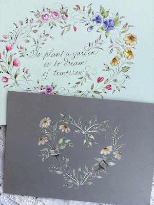

To flourish is to blossom and to grow! It is to expand your skills as a calligraphic artist and it is a pathway to a peaceful process. The short summer season is the perfect time to add some sort of daily or even weekly flourishing ritual to your practice. There is a lighthearted joy that can be found in this process.
Even if you make a dozen mistakes a day as you put ink to paper, you will be building skills and confidence along the way. I think that too many people self edit and believe they don't have a natural instinct for flourishing. I certainly did not have any natural abilities or talent for this art form. It was an intense desire to learn, to practice and to observe the strokes, and a lot of discarded papers along the way!
But the love of the flourish has never faded, in fact it grows every time I put pen to paper. If you would like to join the Flourishing Club or Wildflower Wonders, I would love to share the joy of pointed pen flourishing with you. There is a whole world of discovery waiting for you as you put pen to paper.
I hope you have the most beautiful summer dear friends. Thank you for reading the blog, sending kind messages and for supporting the classes I offer. I love to see you Flourish!

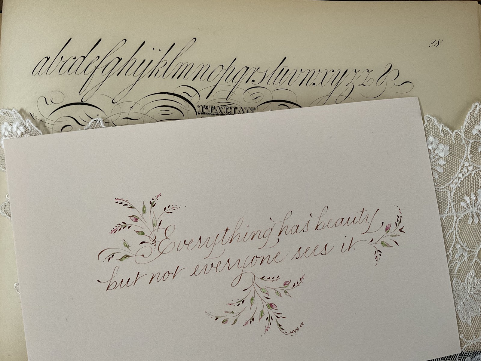
The designs can be completed relatively quickly and can serve well as a daily practice ritual. I always hesitate to suggest a daily ritual even for a short period of time as some students can find this difficult to commit to, much like New Year's resolutions. But what if it was a fearless ritual? What if you had no expectations to share your work on social media, or even to keep what you do? What if you simply flourished and kept what worked, and discarded the rest? This is the freeing and enabling aspect of offhand flourishing. They are small, done on any convenient paper surface that you can find, and can be done with any fluid that you want to use in your pointed pen. They will free your thinking! I find them a resting place for my mind because they don't force me to conform to any alphabet or any one style. They are transformative!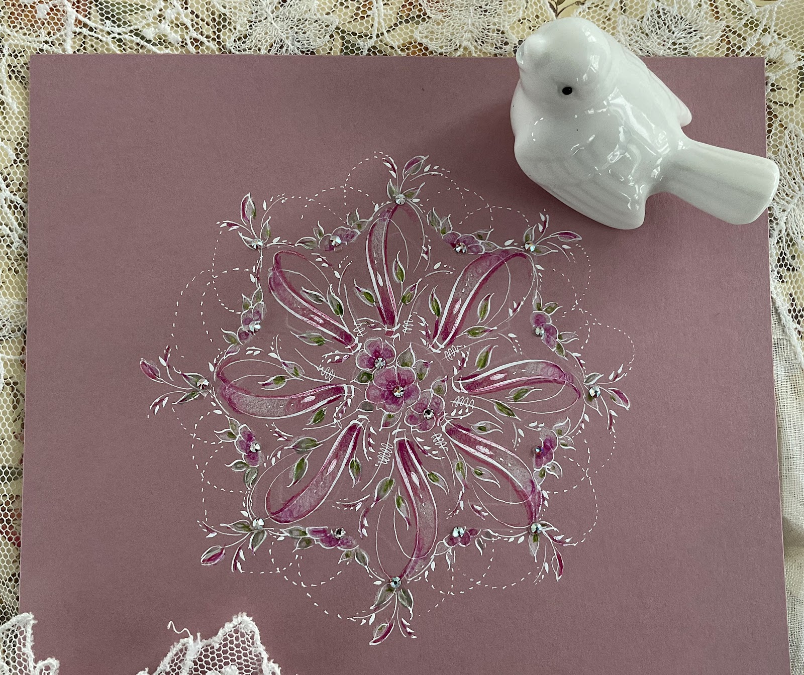
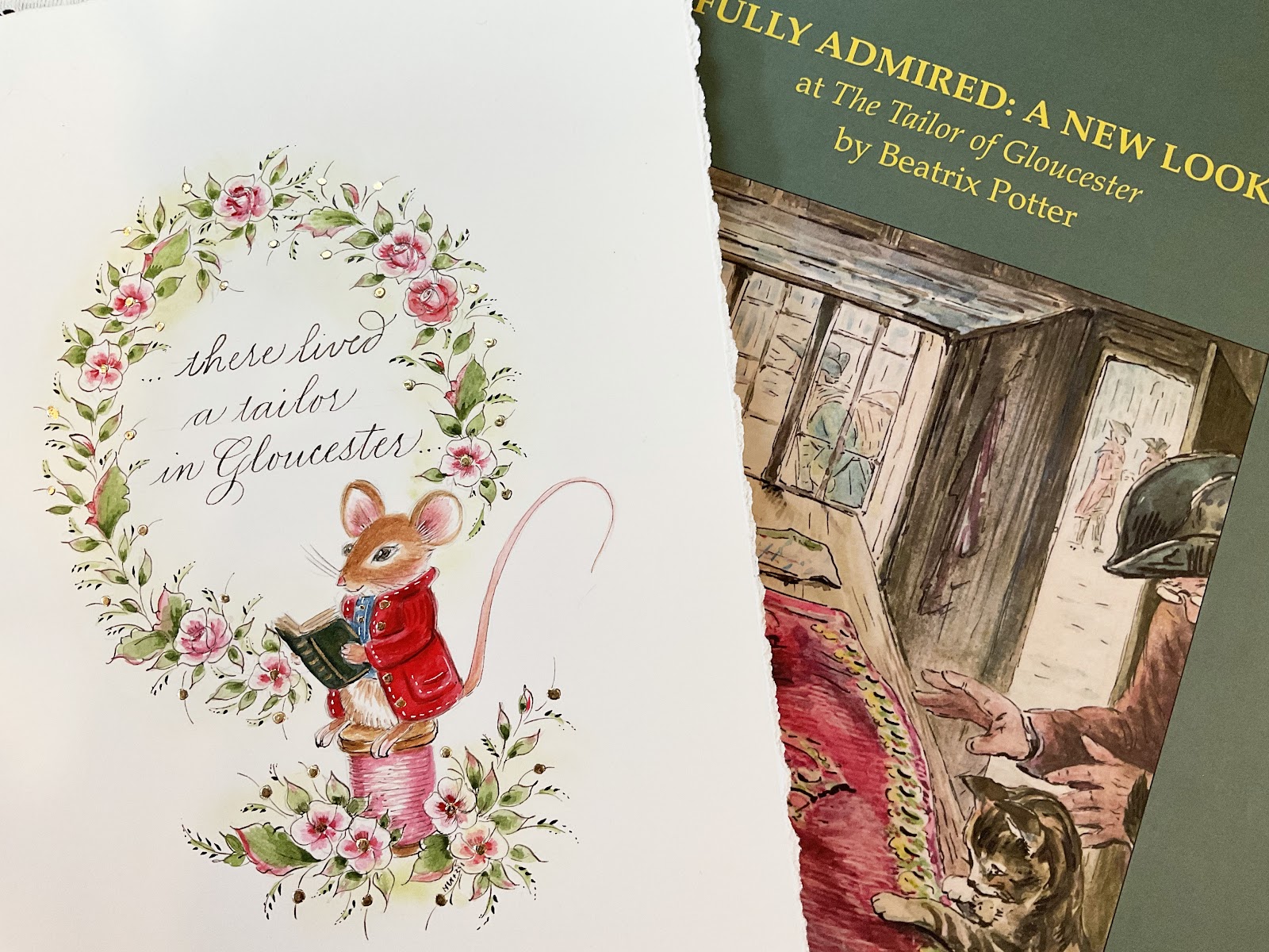
My favourite book to explore with offhand flourishing is Ornate Pictorial Calligraphy reprinted by Dover Publications. The book offers a little bit of instruction but tons of historic inspiration. From there, you can begin to flourish up a storm.
This summer, I have bee doing daily bird flourishes as well as floral flourishes as I prepare for Wildflower Wonders for The Gentle Penman.


To flourish is to blossom and to grow! It is to expand your skills as a calligraphic artist and it is a pathway to a peaceful process. The short summer season is the perfect time to add some sort of daily or even weekly flourishing ritual to your practice. There is a lighthearted joy that can be found in this process.

Even if you make a dozen mistakes a day as you put ink to paper, you will be building skills and confidence along the way. I think that too many people self edit and believe they don't have a natural instinct for flourishing. I certainly did not have any natural abilities or talent for this art form. It was an intense desire to learn, to practice and to observe the strokes, and a lot of discarded papers along the way!

But the love of the flourish has never faded, in fact it grows every time I put pen to paper. If you would like to join the Flourishing Club or Wildflower Wonders, I would love to share the joy of pointed pen flourishing with you. There is a whole world of discovery waiting for you as you put pen to paper.